Prelive is a language-learning product built around conversation practice in immersive scenarios. It serves people preparing to speak in everyday situations, including new residents and international students. I built its public website, which is live and collecting waitlist signups; this case study covers the website, not the learning app.
Live links
My responsibilities
I implemented the responsive interface and animations, refined the website copy, and added localization. I also built the waitlist and referral flows, connected signup storage and confirmation emails, and integrated analytics.
Tools and technologies
- Next.js, React, TypeScript, and Tailwind CSS for the website.
- Framer Motion for animation, Three.js for a decorative image effect, and dotted-map for the language overview.
- Firebase Firestore for signups and referral data; React Email and Resend for confirmation emails.
- PostHog for analytics, custom JSON dictionaries for localization, and Jest with React Testing Library for automated tests.
Project context and challenge
The website needed to explain how practicing conversations in familiar settings could help learners who hesitate when speaking. Its immediate purpose was to make an unfamiliar product understandable and give interested visitors a clear way to register for early access.
Process and key decisions
I structured the page around the speaking problem, visual examples of missions, product capabilities, and a repeated invitation to join. Purple, large headings, rounded forms, and animated scene previews give the site a playful character, while short paragraphs keep the explanation easy to scan.
I reused the signup form across the page and connected both instances to the same validation and storage flow. Separate message dictionaries support 17 website languages, and successful signups lead to a personal referral page. The mission visuals preview the app experience; the website does not run the learning missions.
Solution
Hero and first signup
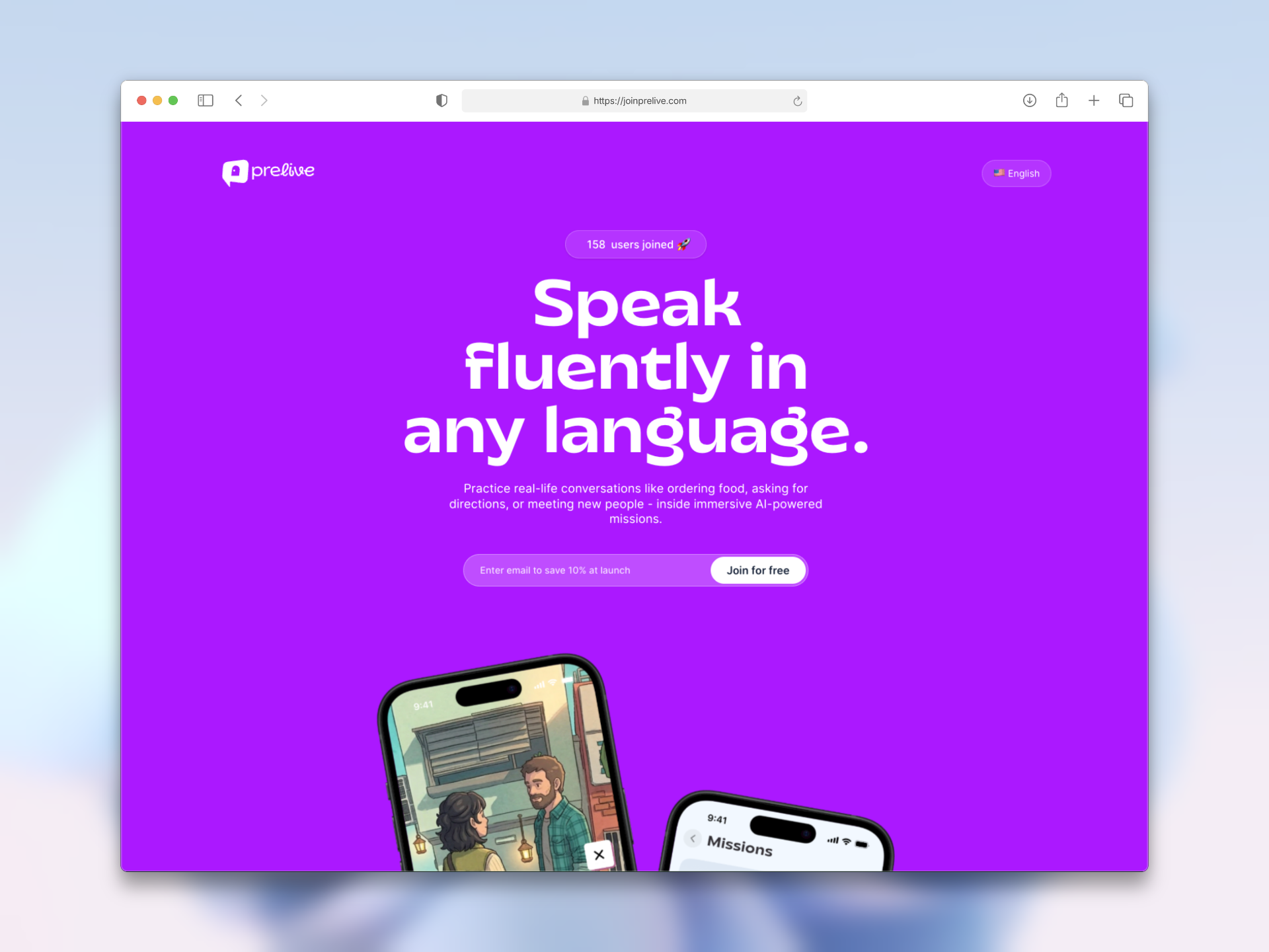
I paired the speaking-focused headline with phone previews to introduce the product quickly. A prominent email form makes joining the waitlist the first available action. I kept the header focused on the Prelive logo and a language selector, giving visitors a way to read the page in their preferred language without adding a large navigation menu.
Speaking under pressure
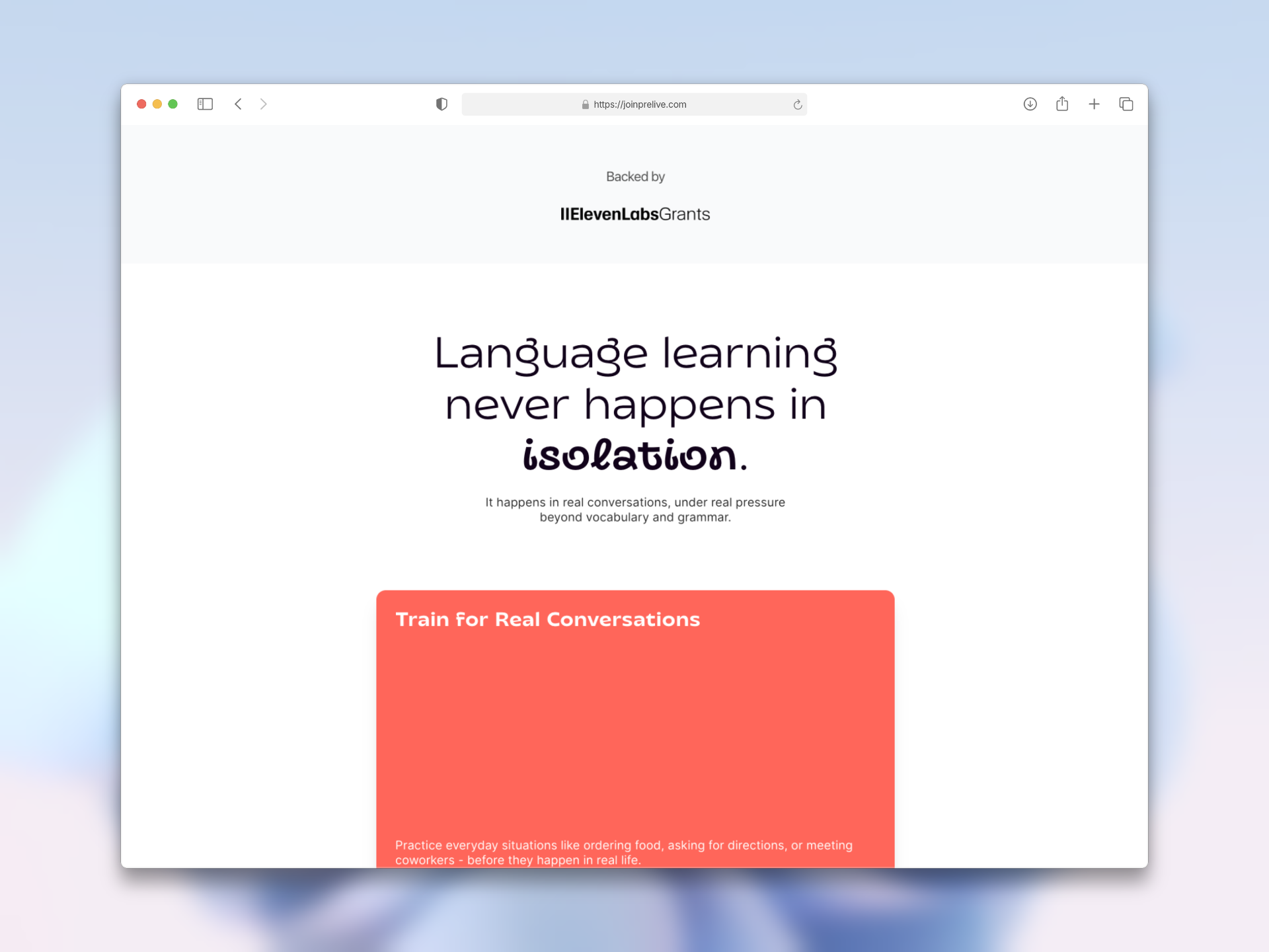
Four colored cards introduce conversation practice, confidence, hesitation, and feedback. I used a stacking scroll animation to present these ideas in sequence and connect the product to familiar speaking difficulties.
Real-life missions
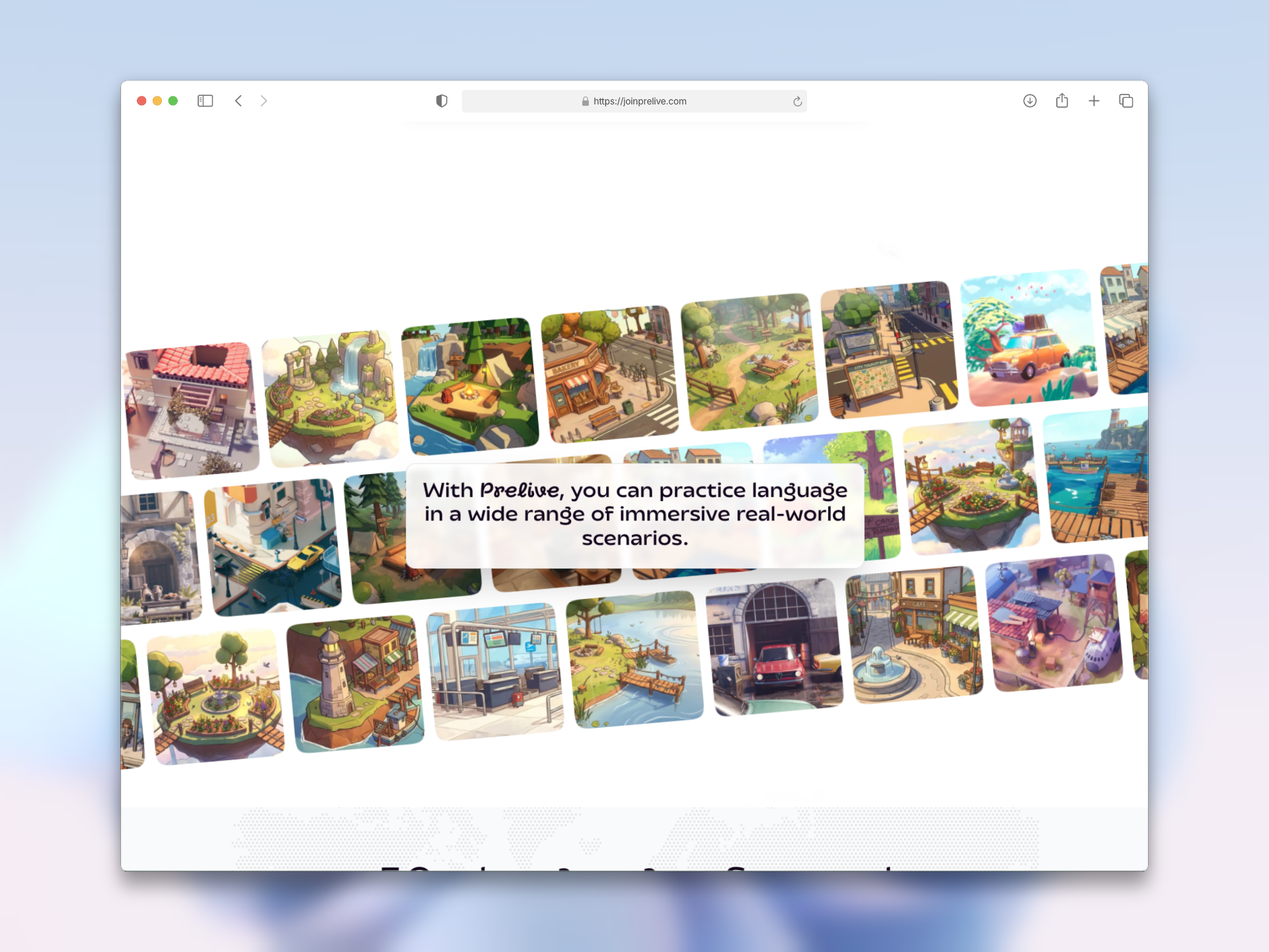
I arranged scene previews in moving, angled rows to show the range of environments presented by the product. A central text panel explains their purpose while the imagery makes the mission concept tangible.
Language coverage
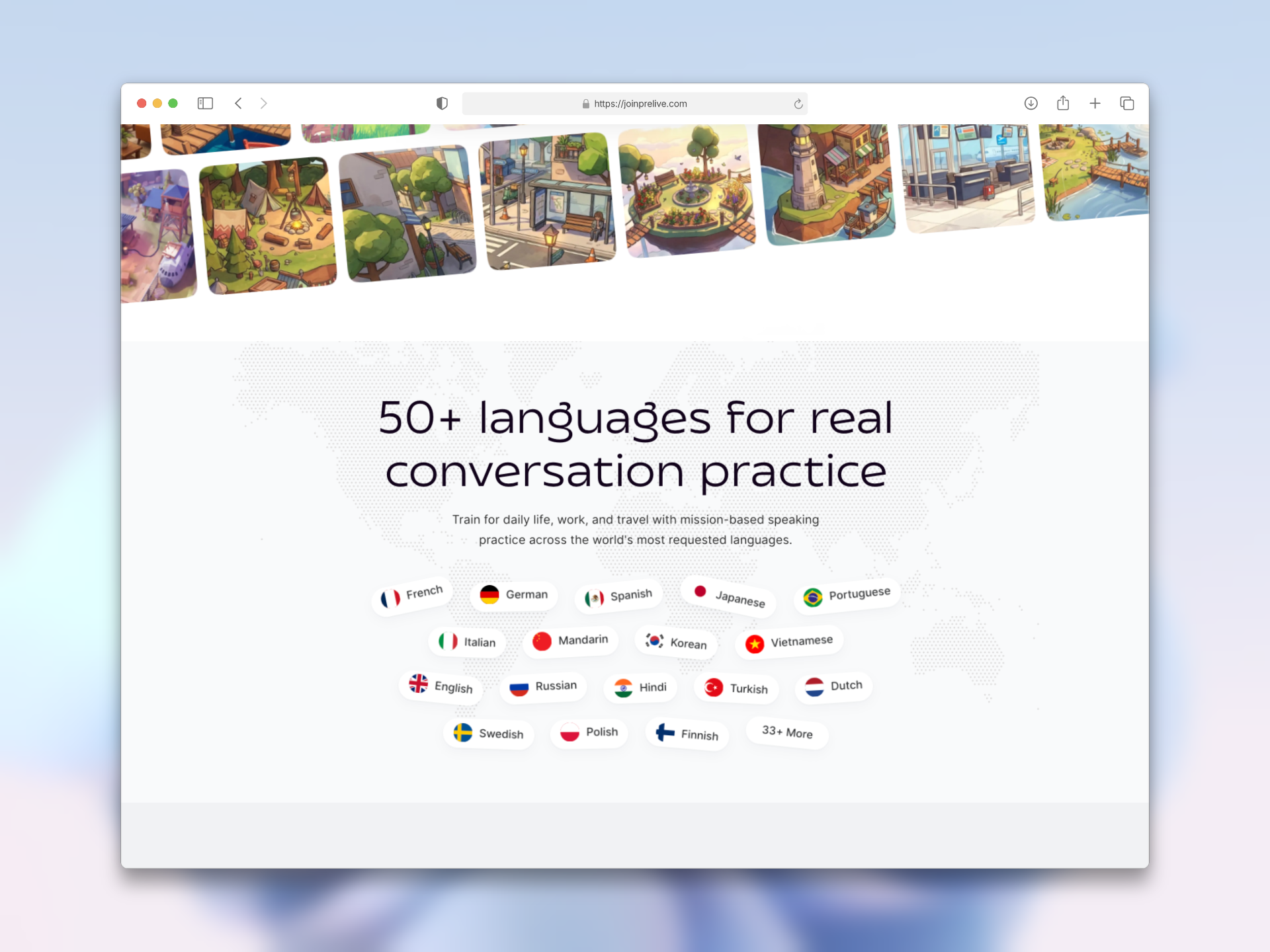
I used a dotted world map and labeled language chips to communicate the app’s advertised language range. This product overview is separate from the website’s own translation options.
Key features and sign up
I organized the promoted app capabilities into six brief, icon-led items covering missions, native-speaker practice, scenarios, AI characters, speech feedback, and personalization. A responsive grid makes the overview easy to scan across screen sizes. After the feature overview, I repeated the signup form beside a collage of people. This gives visitors another opportunity to request early access after they have learned more about the product.
Frequently asked questions
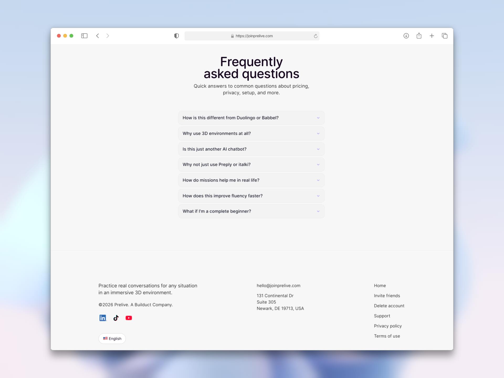
I used expandable answers to explain the mission format, beginner support, and differences from other learning approaches. Native disclosure elements keep the section compact and let visitors choose the detail they need. I grouped contact details, social links, language selection, and product links in the footer. Links to support, account-deletion guidance, privacy, and terms make practical information accessible from the landing page.
Referral signup
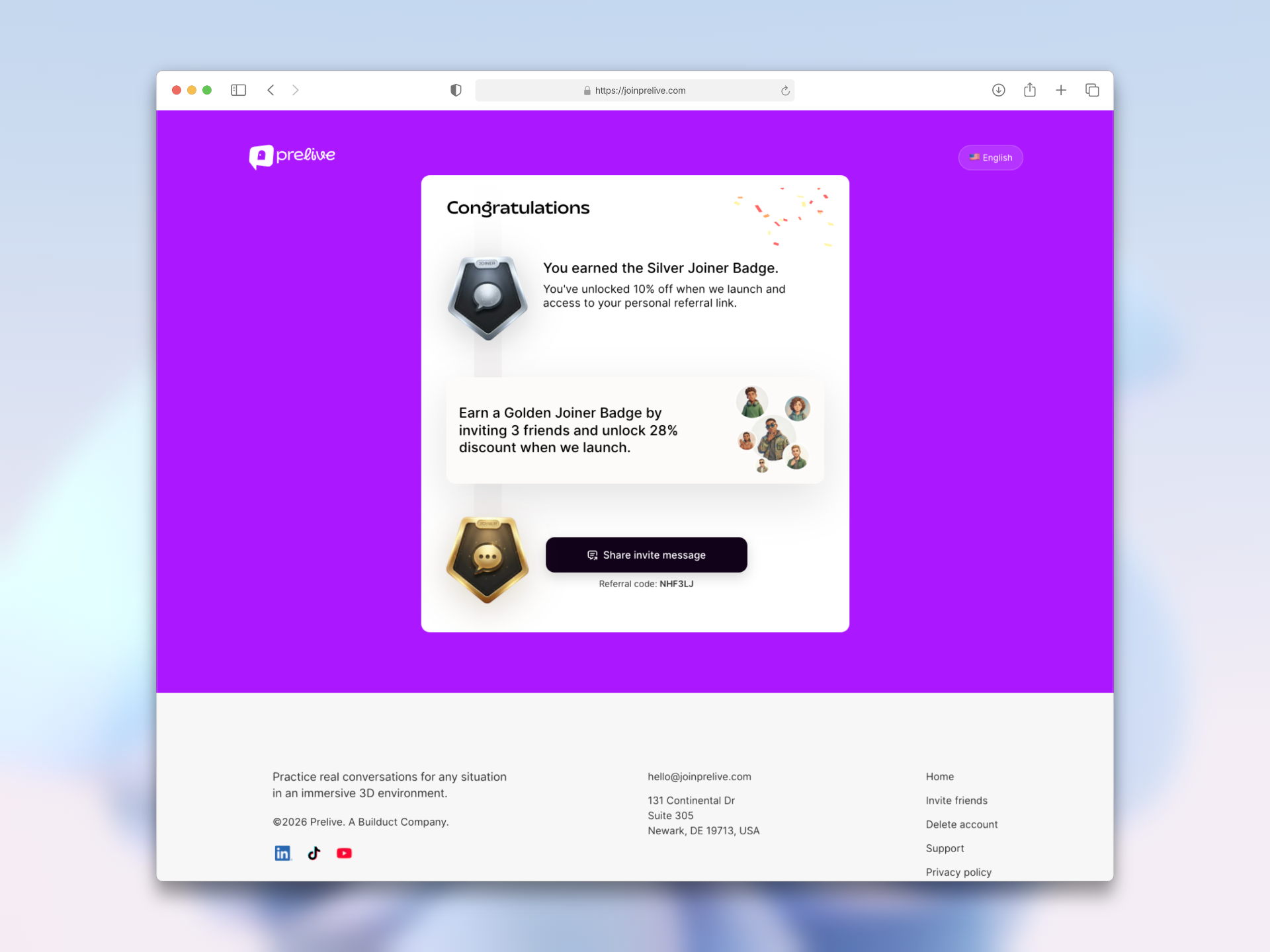
I built a referral flow that gives each waitlist member a personal invite link to share with friends. This helped bring in 40+ user registrations.
Validation and outcomes
I delivered a live, responsive waitlist website with localized content, referral sharing, confirmation email integration, and supporting pages. The repository includes automated tests for signup and sharing flows. The current public site continues to invite early-access registrations.