Wastenify is a waste collection platform for households and businesses in Ghana. I designed and built its landing page to introduce the service, explain the mobile app, and connect with both customers and potential collectors. The website is live.
Live links
My responsibilities
I worked on the page structure, visual design, responsive layouts, and frontend development, taking the landing page from design to a working website.
Project context and challenge
Wastenify aims to make waste collection more reliable and give people visibility into pickup and disposal. The website needed to explain that value clearly while serving two audiences: people who need collections and collectors looking for work.
Tools and technologies
Figma, Next.js, React, TypeScript, Tailwind CSS, and Vercel.
Process and key decisions
I structured the page around what visitors need to know: what Wastenify offers, how it works, where waste goes, and how to become a collector. Green and cream backgrounds, clear typography, waste collection imagery, and an app preview give the service a consistent visual identity.
I translated the design into reusable React components, adapting the layouts for desktop, tablet, and mobile. Shared download controls and navigation keep the experience consistent throughout the page.
Solution
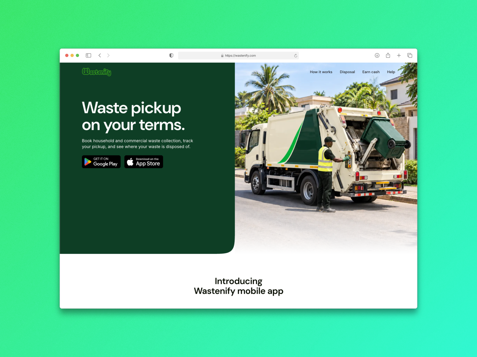
Hero and navigation
I introduced the service with a clear headline, waste collection imagery, and app download options. The navigation helps visitors jump to the service steps, disposal information, collector opportunities, and support.
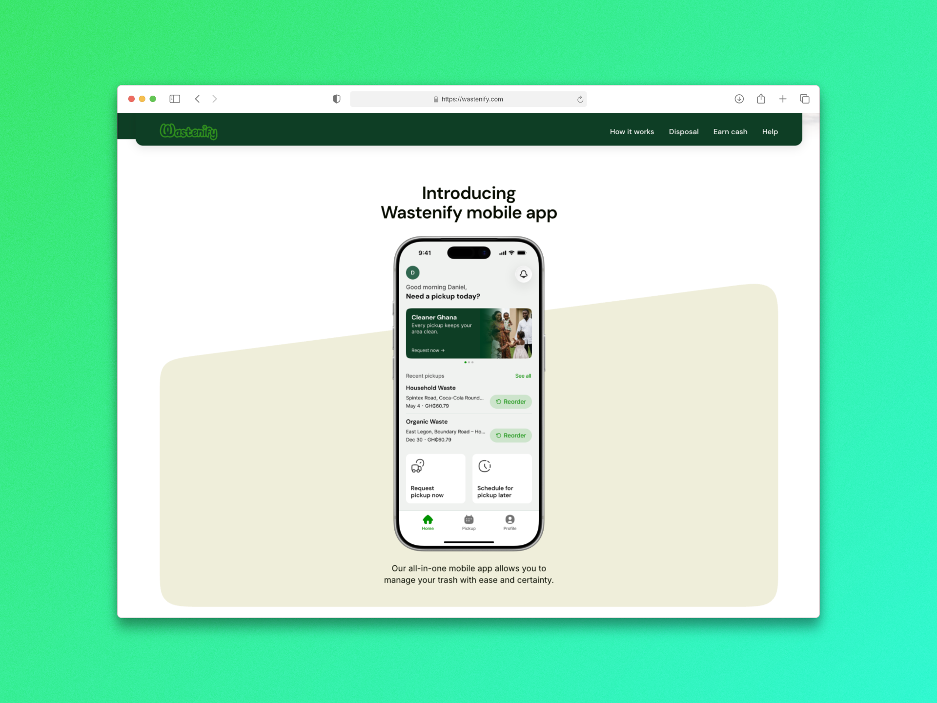
Mobile app introduction
A large phone preview introduces the Wastenify app and gives visitors a first look at the pickup experience. I kept the supporting copy short so the interface remains the focus.
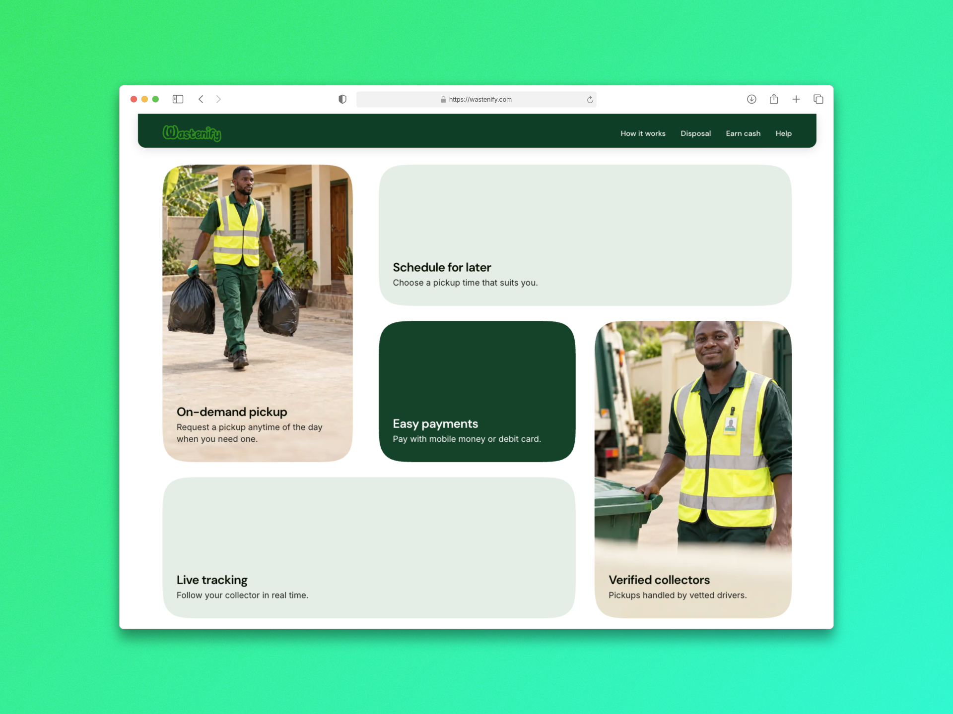
Key features
I used a grid of cards to highlight on-demand pickup, scheduled collections, easy payments, live tracking, and verified collectors. Each card pairs a clear benefit with a short explanation, making the features easy to scan.
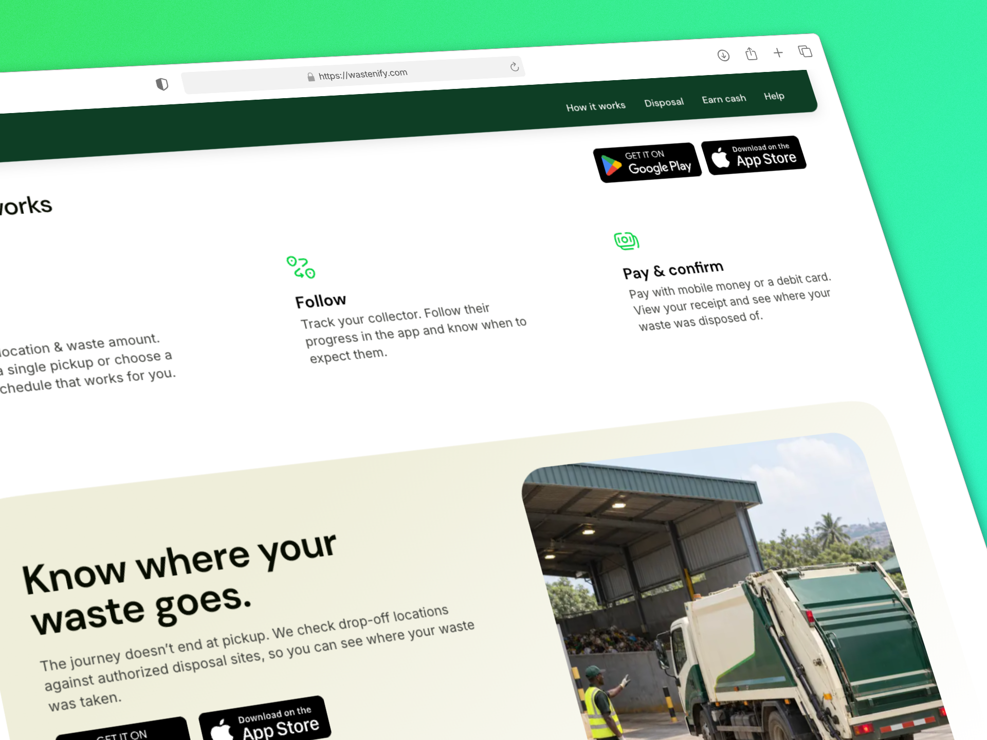
How it works and Responsible disposal
I broke the customer journey into three steps: book, follow, and pay and confirm. Simple icons and concise instructions explain the process from requesting a collection to viewing payment and disposal details.
This section explains how Wastenify aims to give customers visibility into where their waste is taken. I paired the message with disposal imagery to show that the service extends beyond collection.
Collector recruitment
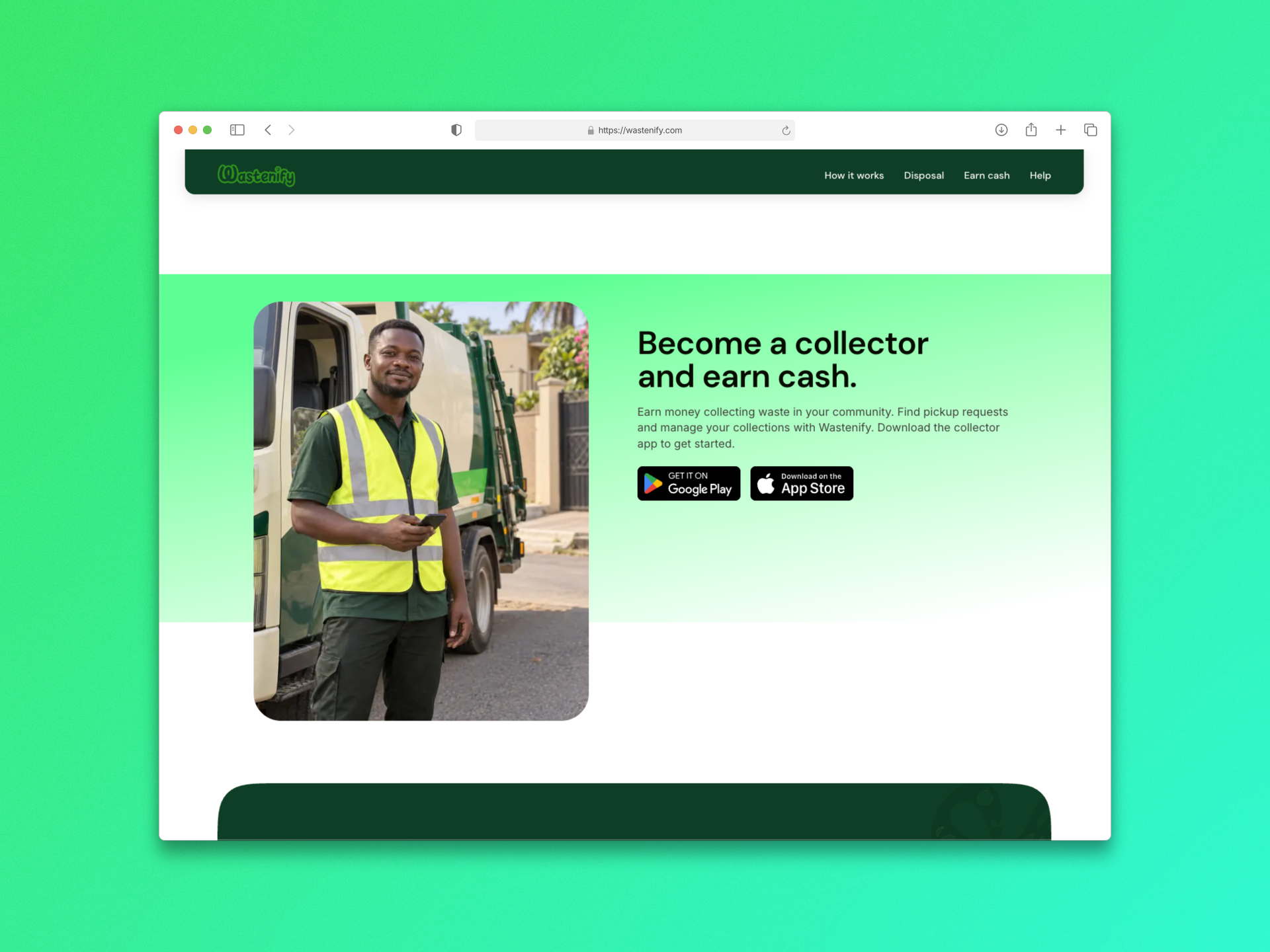
I created a dedicated section for people interested in earning money through waste collection. Collector imagery, a direct invitation, and separate collector app download options give this audience a clear next step.
Final download prompt and Footer
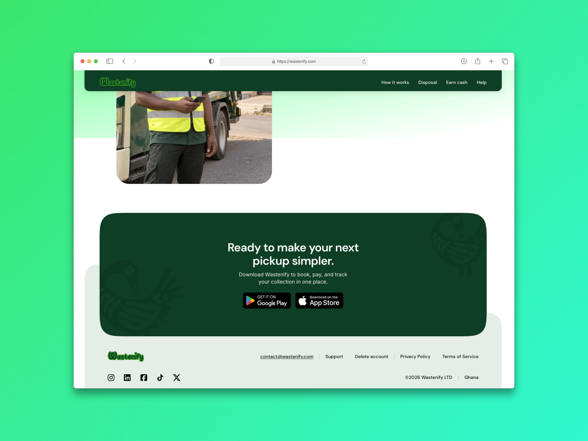
The closing call to action brings the focus back to the app, reminding visitors that they can book, pay, and track collections in one place.
I grouped contact, support, account deletion, and legal links into a clear footer. It gives visitors a consistent place to find help and practical information about Wastenify.
Validation and outcomes
The delivered website was checked across desktop, tablet, and mobile layouts. It gives Wastenify a public introduction to its service, with customer and collector app downloads currently marked as coming soon.